WRI Website Design & Build
WRI Brand and Website Design & Build
I'll be adding to this section in the coming weeks. Watch my socials for more on the Design & Build of WRI 2024, but this will give you a birds-eye view of the overall process.
The Wheel Rail Interface Past and Future
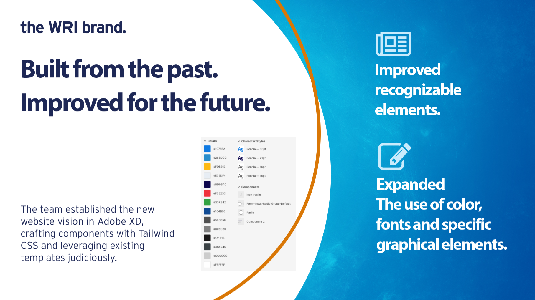
WRI's long history has helped to develop a brand that has a few recognizable elements the team wanted to build upon.
Building on past branding
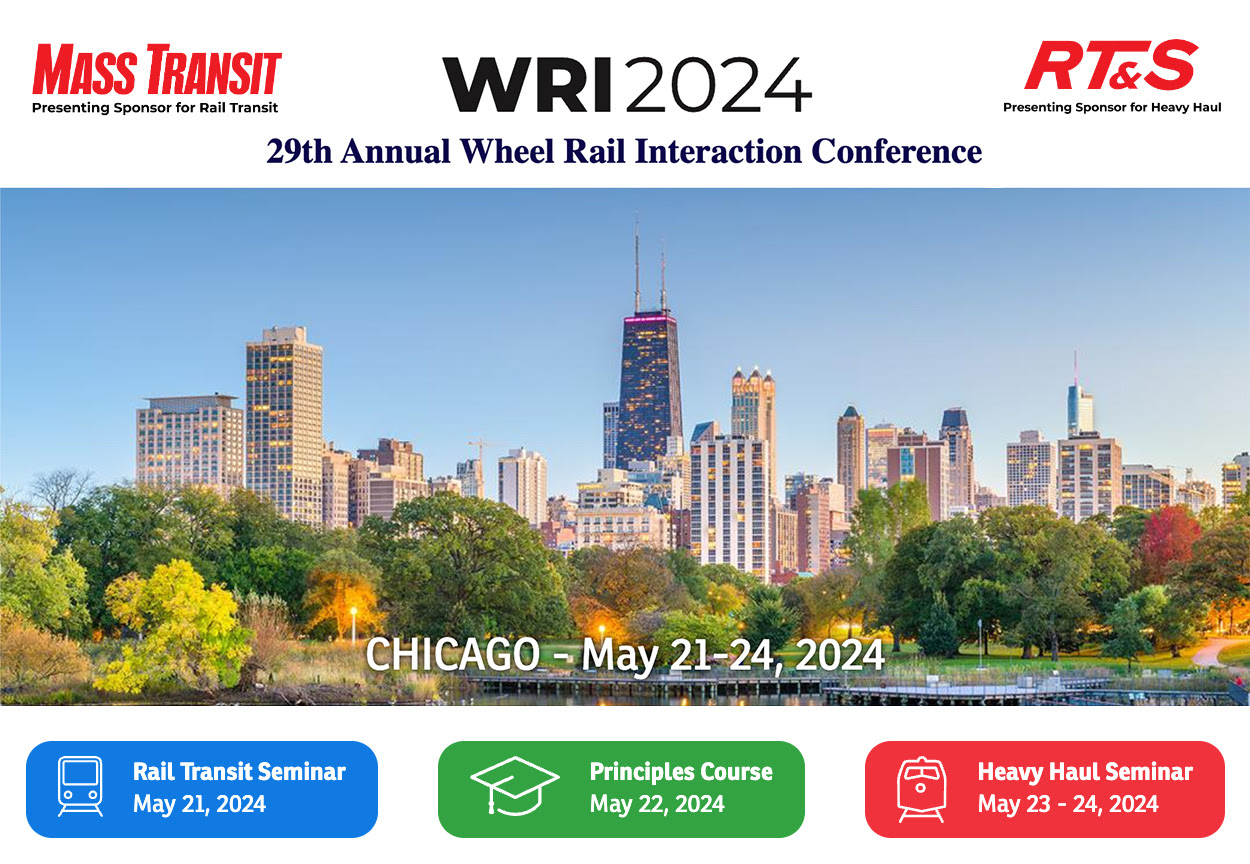
Most notably, the city skyline used on the previous website, marketing material and event collateral is one of the most recognizable elements of the brand, so we kept and improved on that these with a full-width image for WRI Chicago.
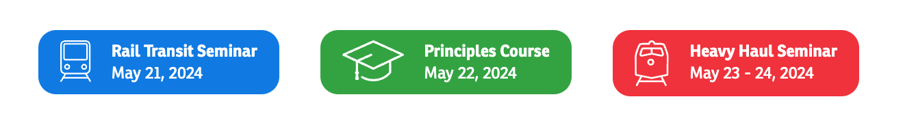
The three seminar icons with their themed colors is another important aspect of the brand's recognizability we noted. We took these icons and improved upon to create the three buttons for the events as seen here.
Identifying layouts, color and fonts
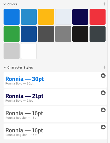
We standardized on the color palette not only for the three key colors - red, green and blue - but also the yellow used for the InfoZone and ExpoZone. In addition, we came up with a secondary color palette for other elements of the website as well as a font to use other than the main font for the WRI name.
My Process
Mapping the user journey
We covered the goals and business requirements above. Once defined and the project deliverables are signed off, I engaged the creative team in a discovery session with data from an Google Analytics. The team reviewed the data to determine page popularity and user flow through the site. This helped us to prioritize where we should focus improvements on the user journey through the website, the content flow and organization, and details on how to improve the registration process in particular.
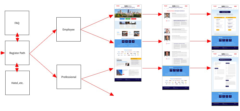
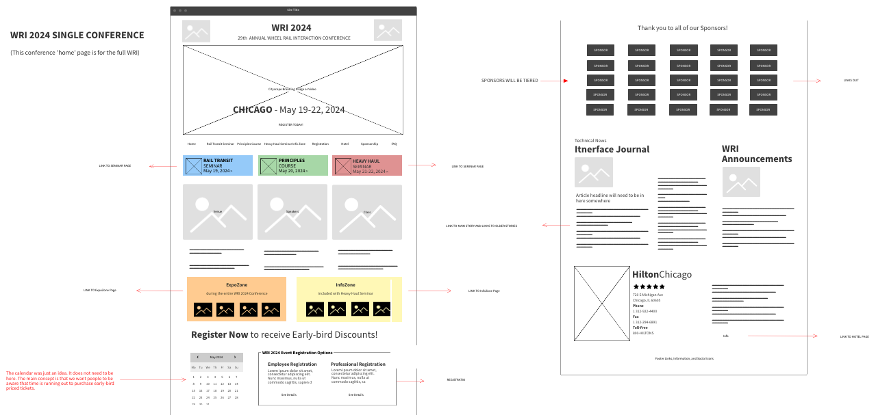
Wireframes and Concepts
Next, we collaborated on Notion with mood boards to share things we liked about other event sites and offered up ideas on how we feel the site should look and feel. This was a balance in preserving the best of the historical branding versus improvements we wanted to see that makes websites look modern and communicate information clearly and quickly. Most importantly, we used the wireframes to organize content and set up the page flow in important areas such as registration. The wireframes led to the concepts which were developed in Adobe XD.
Project Build
The WRI 2024 website build was accomplished in several phases where, in general, I would develop a template page, share a draft of the page for comments and changes, then fine tune and polish it for production. This process was repeated over and over again for each page, section and sometimes even particular UI elements. This culminates in a round of testing them launch!
NOTE: I'll be adding more detail of the process in the next few weeks (Summer 2024).
Tools of the trade
TailwindCSS
I describe the component-based nature of the build in the next section, but I wanted to take a moment to introduce one of the stars of the show here. TailwindCSS is a utility-first CSS framework that simplifies web development. TailwindCSS boosts development speed, reduces unused styles for faster load times, and facilitates building unique, efficient websites.
Tailwind saved me time in building WRI 2024. Tailwind also enhances consistency and maintainability over time, allowing for easy adjustments to design elements of the website over time. It's an essential tool for modern developers prioritizing efficiency, maintainability, and performance in web design that will work to WRI's benefit over the years.
Tailwind templates helped save time!
Another aspect of the build that was used to save time was the use of templates. Templates will also help us add features or sections over time to keep costs down.
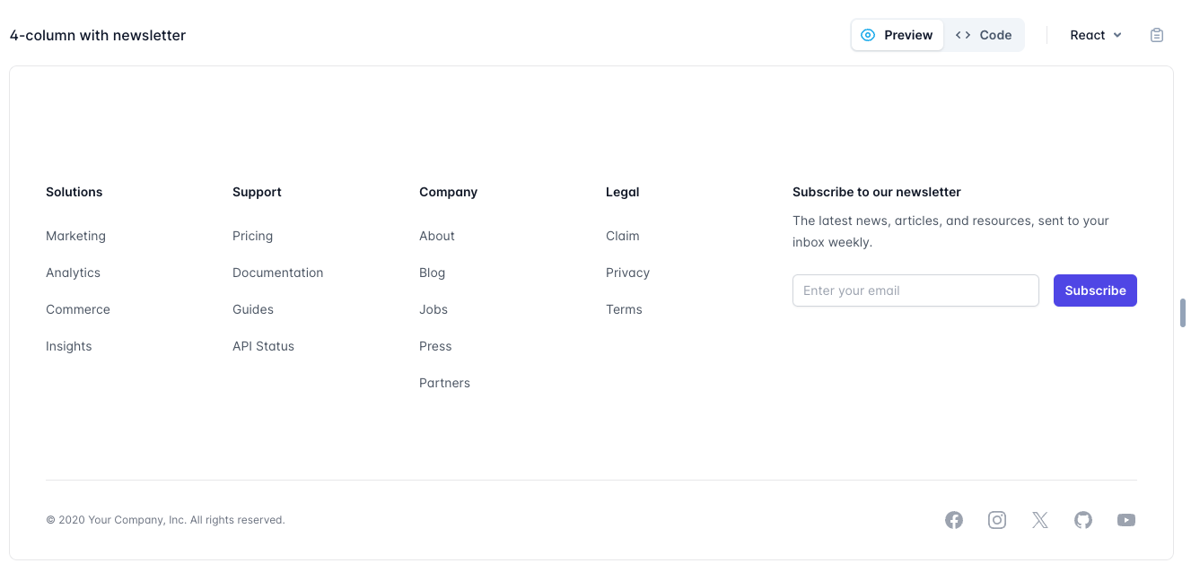
Footer template example
This is an example of a footer component that has little styling that we used over the original design as we needed to have a place for more links.
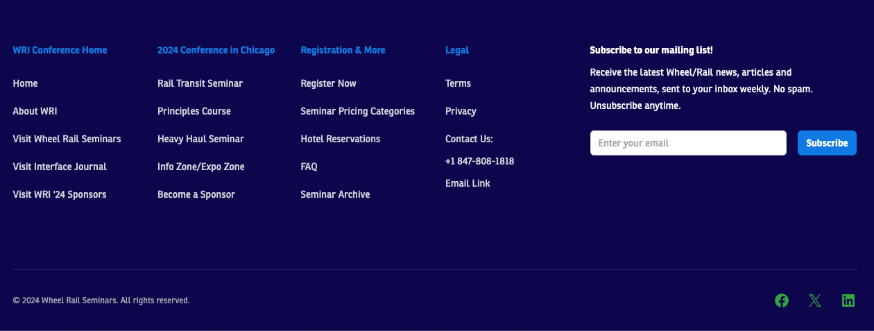
And this is the final look of the footer after we added our category and link names as well as our font and colors.
Sponsorship Call to Action (CTA) template example
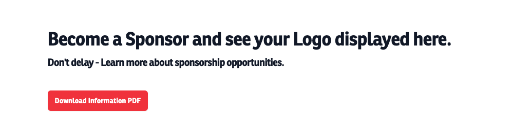
The CTA is another template that was used as a call out to download the PDF document for sponsorship opportunities. This may look simple on the surface, but the component code is developed to resize as needed for multiple devices. A lot of time went into this template to make it as battle-hardened as possible. We gain the benefit of all that work with a copy, paste and configure.
NOTE: I'll be adding more detail of the process in the next few weeks (Summer 2024).